UltraBlocks Feature Overview: Advanced Button Settings
Buttons appear in multiple Gutenberg and UltraBlocks components. We’ve made it easy for you to customize the look and feel of your posts and pages with different button settings available in the right-side panel of your gutenberg editor
UltraBlocks components that use buttons:
- CTA (Call-to-Action)
- FlipBox
- Author Info
- Pricing
- Twitter Share
This article uses CTA as an example, but settings are similar across the blocks.
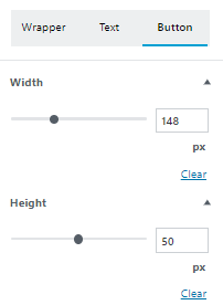
Width and Height
You can set width and height of a button in pixel via the Gutenberg editor section or using the live resizer
Border Styling
This section allows for changing


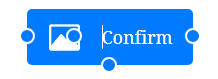
Button Image / Icon Button
Ultra blocks support image button + text, image button, or regular text button.


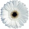
Custom images can be uploaded or existing icons can be used from UltraBlocks Dashicons set. For best results, imagfeHere’s the example of custom image:
Text Styling
UltraBlocks buttons support most of the text styling options: Font-size, font color, bold, italics, underline, strikethrough.